Case study: PepsiCo | Photogenic office space for new generations
Understanding diverse needs when creating an office space intended mostly for future employees of an emerging organizational structure – this is the foundation of an office project in Cracow for the American FMCG giant.
Our consultants and designers were recruited to arrange the work environment for PepsiCo in Cracow. The main guidelines were to create a functional and design-led space that would fully reflect the spirit of the company and emphasize the international character of PepsiCo, built on the principles of DEI (diversity, equity and inclusion).
Project objectives:
- Arrange an office that will attract talent and encourage employees to show up in it
- Plan functionalities and solutions that correspond to working in a hybrid model
- Convey the energetic style and values that the PepsiCo brands represent
Client context
PepsiCo is one of the largest manufacturers and marketers of food products and soft drinks in the world. The company approached Colliers Define following the establishment of a new organizational structure. The new space was to serve as an attractive tool to promote the company and support the recruitment process, as well as introduce new employees to the world of PepsiCo.
When conceptual work on the new office began, the company employed less than 100 people, and today 800 employees work there. With the ultimate number in mind, Colliers Define specialists embarked on the arrangement of 5,000 sqm spread over three interconnected floors, located in the Brain Park office building in Cracow.
Strategic process
Our team of work environment strategy consultants had to contend with understanding the diverse needs of employees when creating the office space, which is nowadays considered a starting point in the conception of a new office, especially if it is to meet the objectives of working in a hybrid model. In this project, this was a key challenge, as the new premises are mostly intended for future employees of the emerging organizational structure, whose preferences are not known.
The cooperation also included a complex change management process in the Client’s organization. The Colliers Define team prepared informational materials, such as newsletters and an office guide, among others, in order to properly prepare everyone for the transition and familiarize them with the concept of the new space. A coherent graphic design and the slogan “Be Beyond, Be PepsiCo” were developed to distinguish the communication regarding the new office. Project ambassadors were also invited – people who represent the teams and ensure that there is a good flow of information between the project group and the employees.
From ideas to shapes
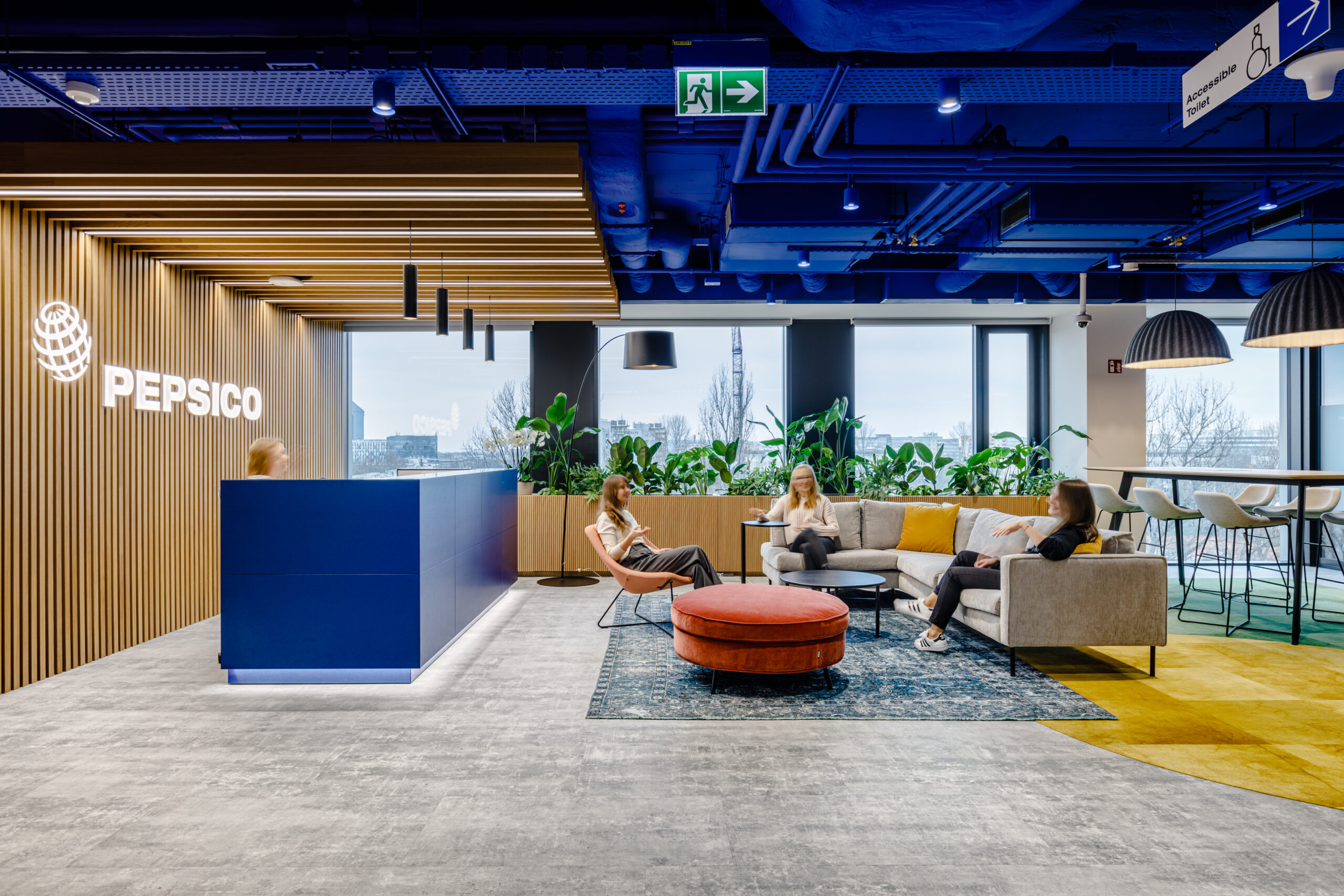
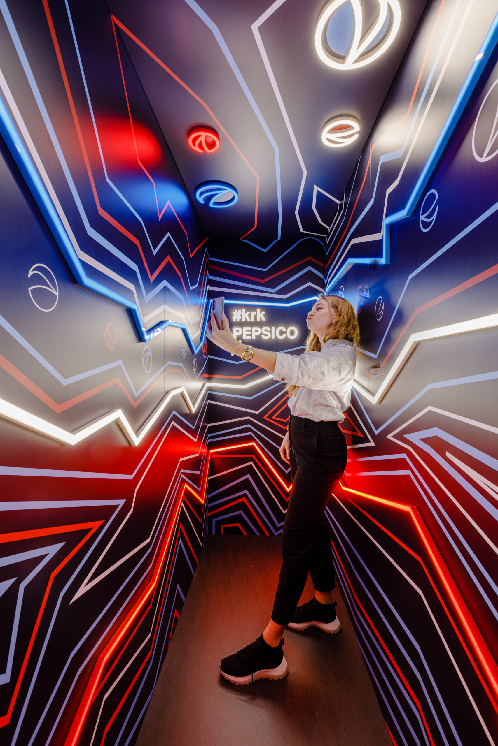
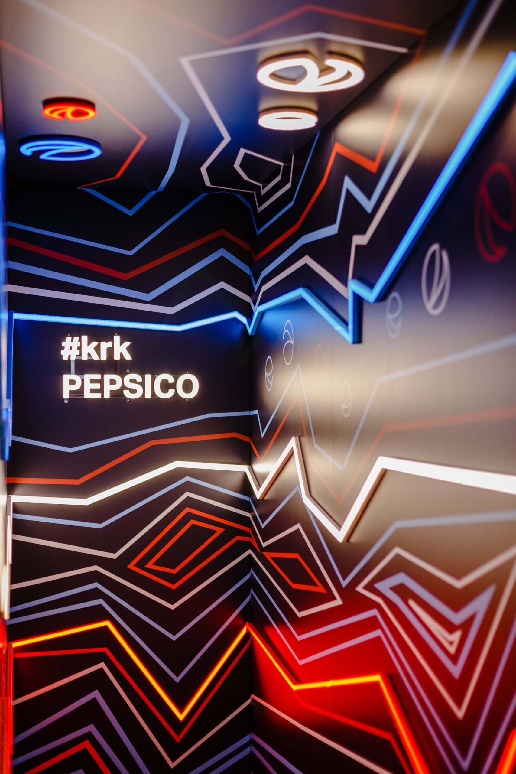
An office that an employee wants to show off is the best recommendation for the space itself, as well as the company where he or she works. This is why an Instagrammable Office was created – a “photogenic” interior that encourages people to take photos of themselves in the office and post them online.
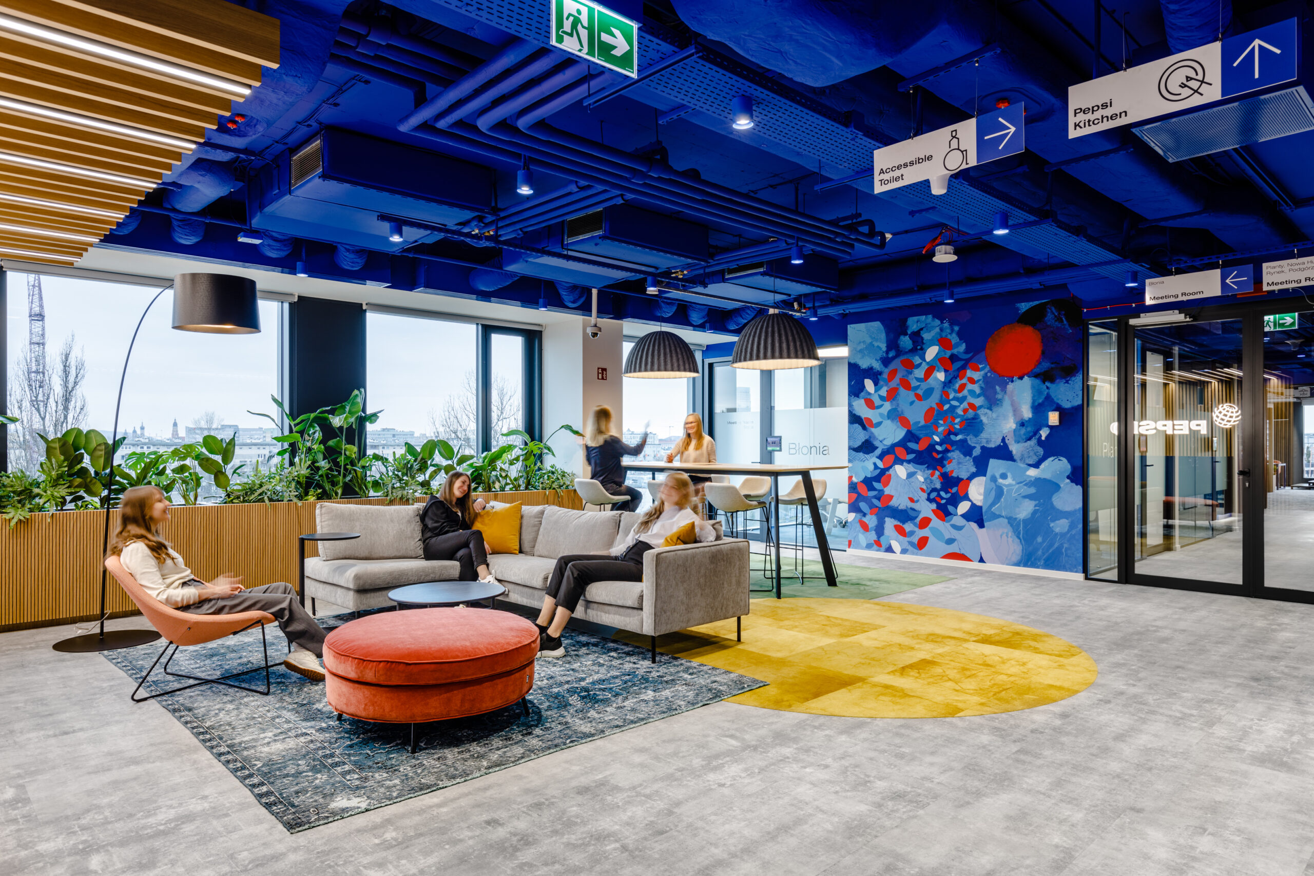
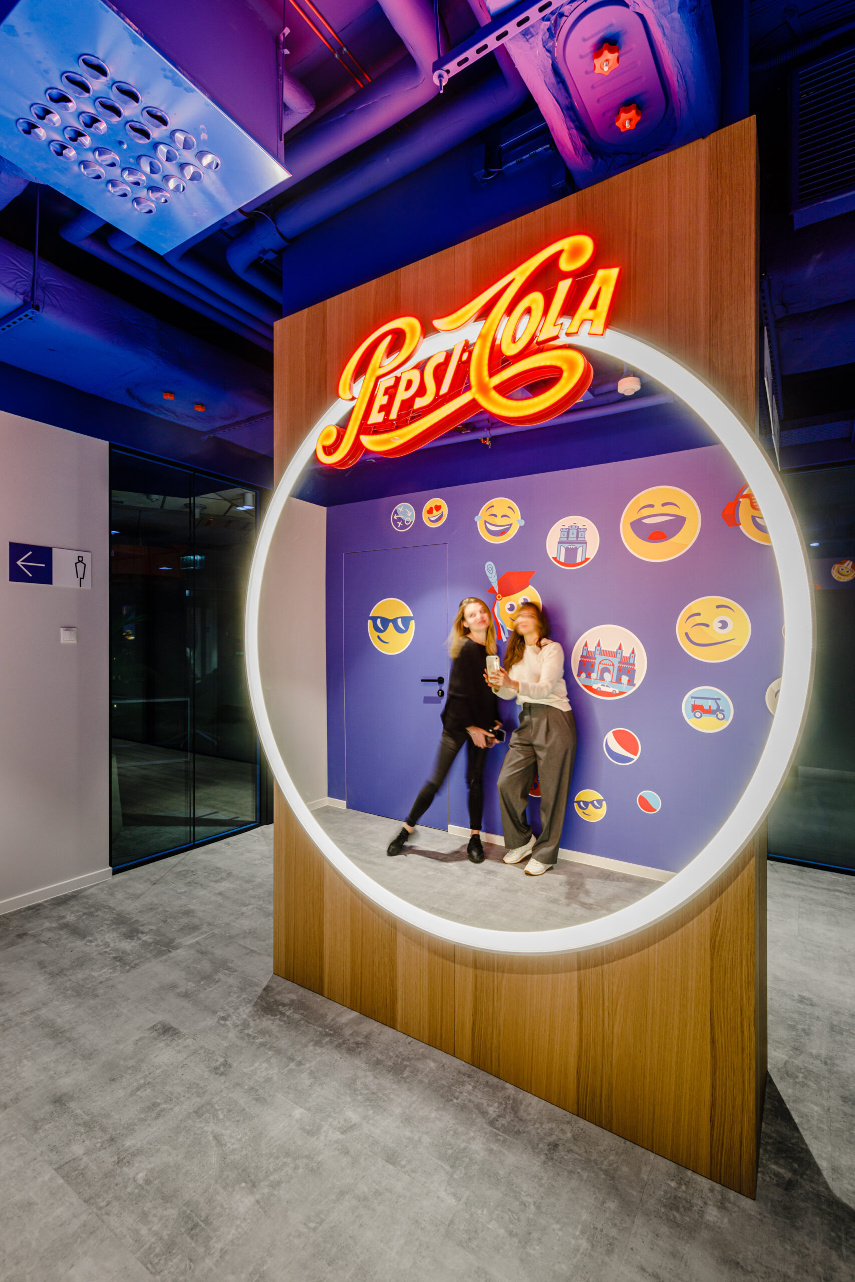
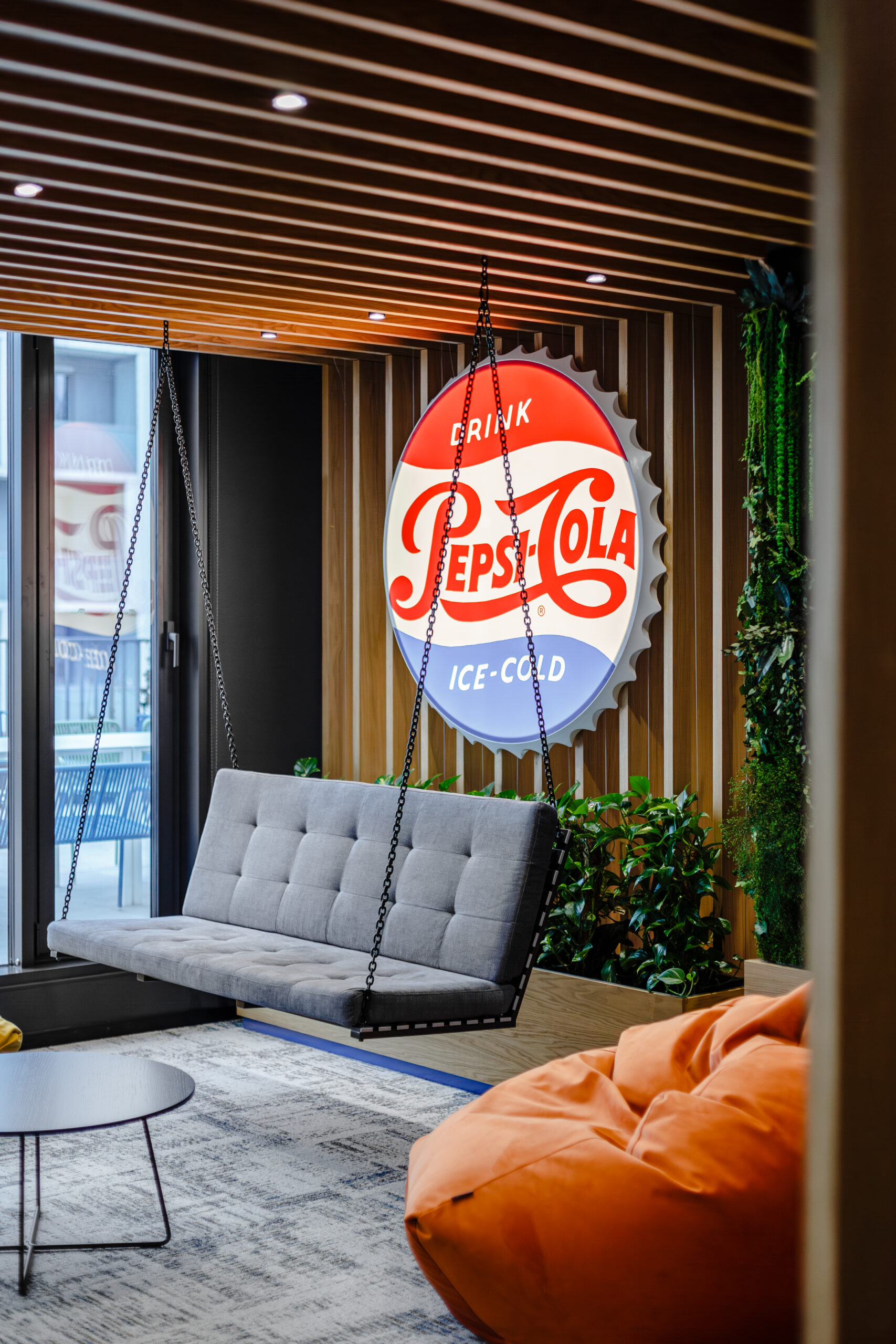
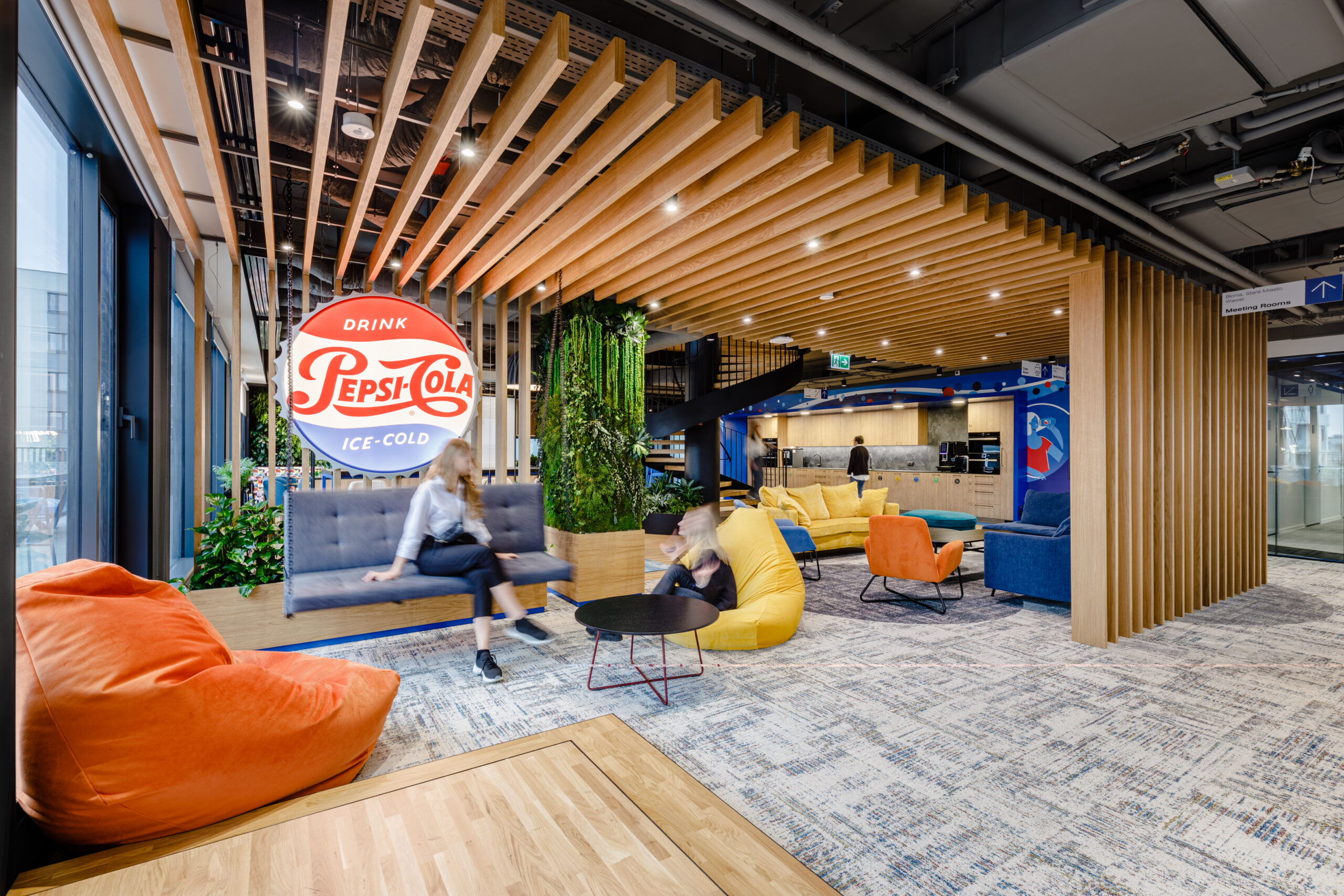
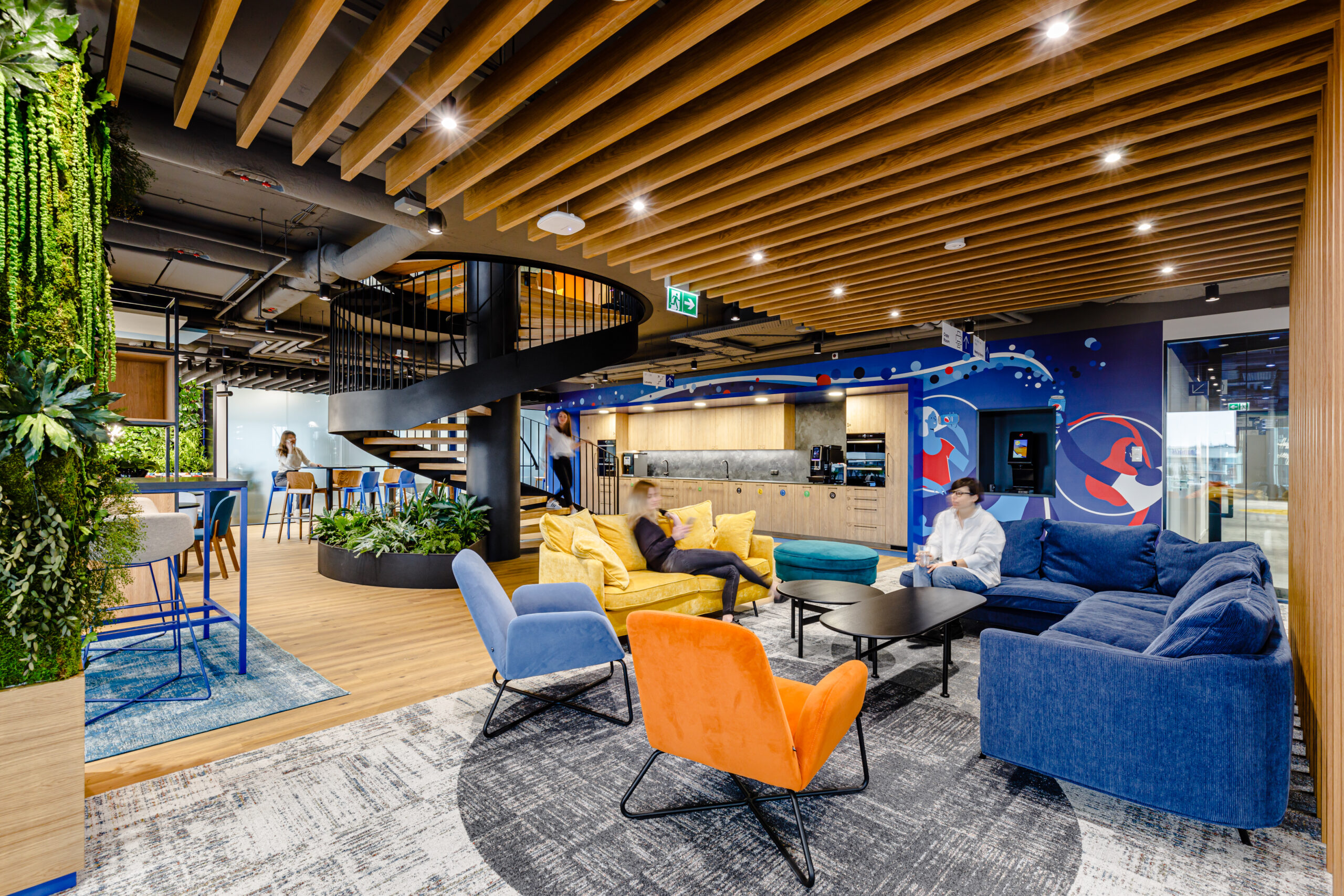
As the majority of PepsiCo’s employees are representatives of Generation Z, for whom social media presence is a daily occurrence, it had to be modern and design-oriented, as well as comfortable and functional. The design elements include a so-called insta box – a space where you can take a photo of yourself surrounded by colorful graphics and lighting, a mirror with a Pepsi-Cola neon sign perfect for a selfie, a mural inspired by the company’s themes, and a recreational space with a swing and a large vintage-style Pepsi logo.
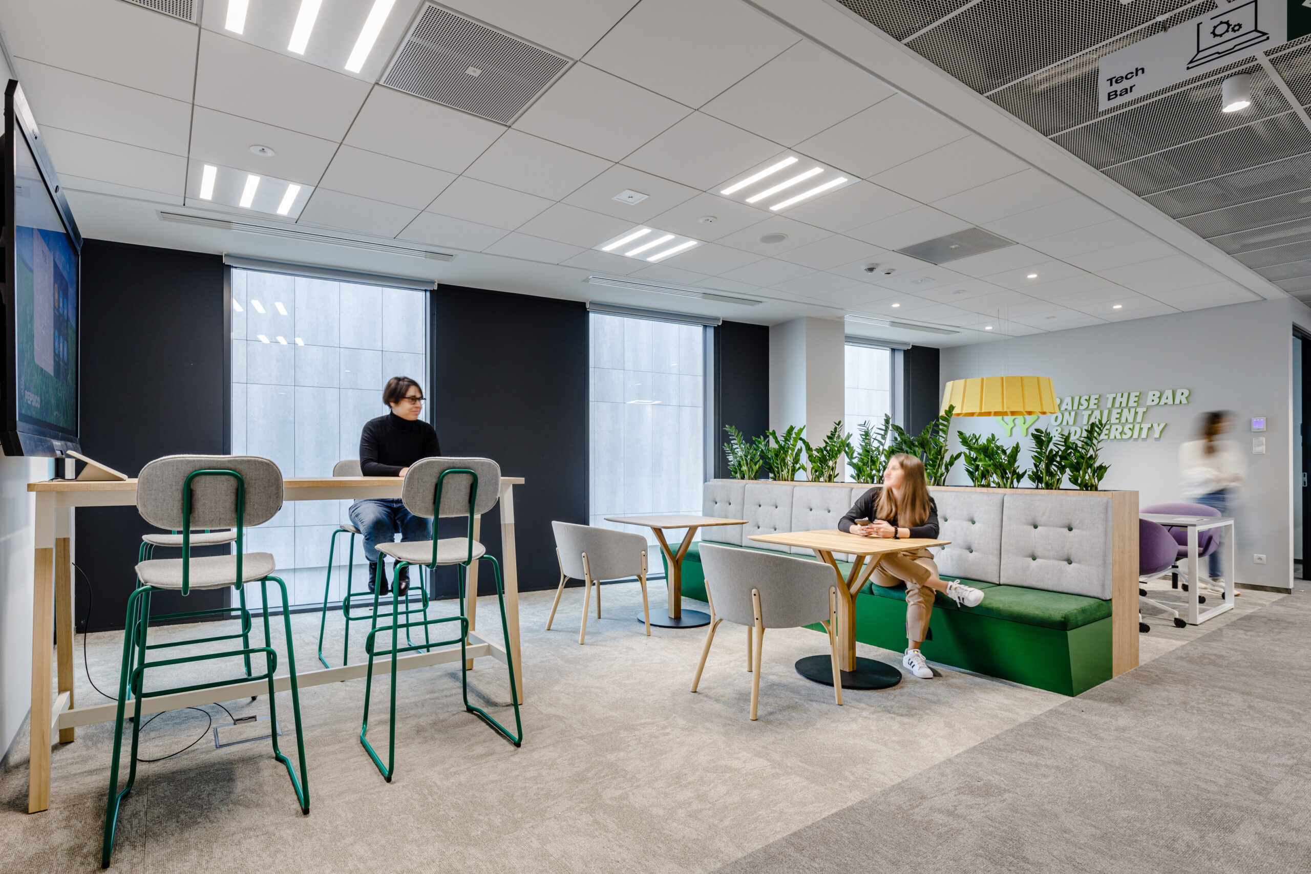
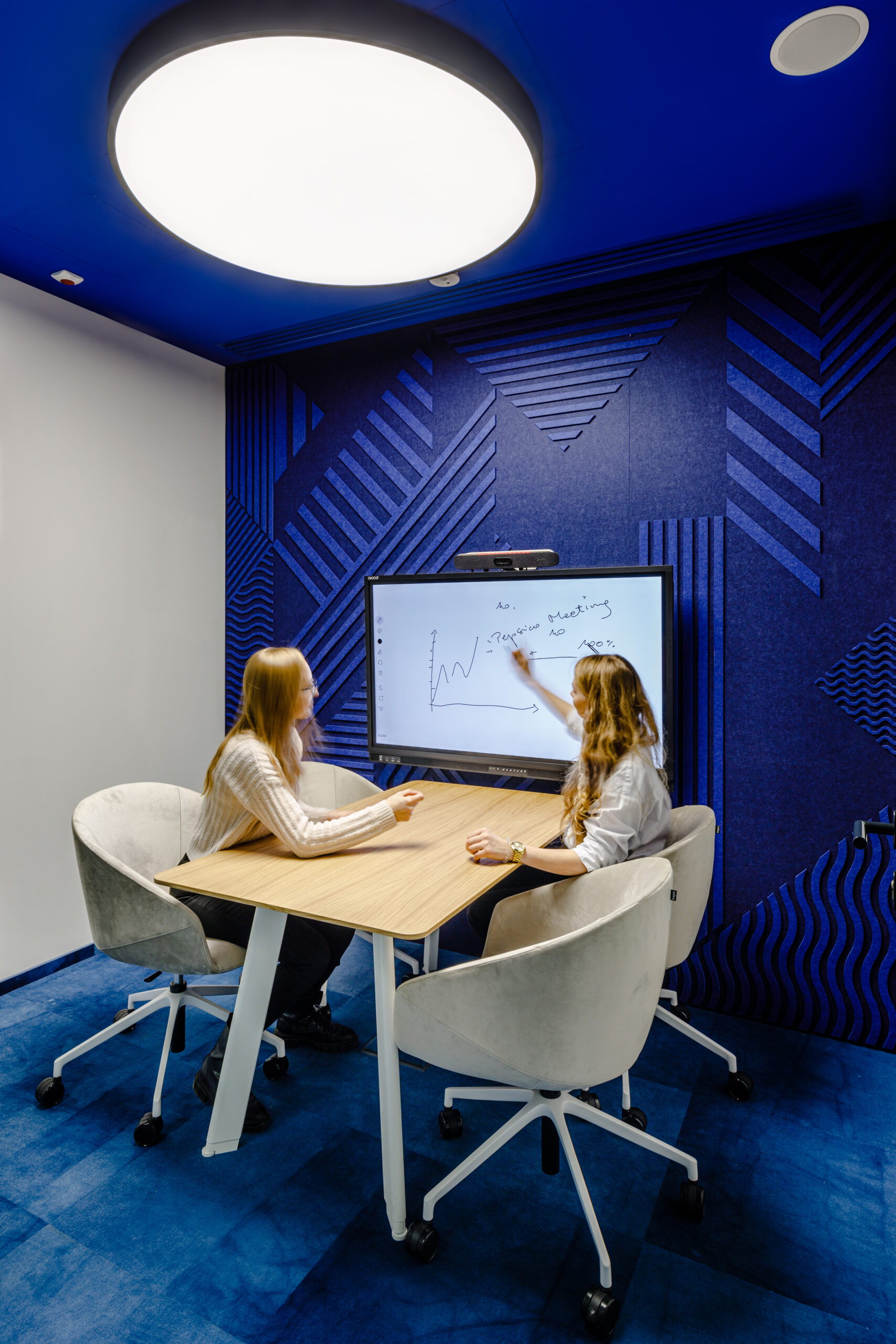
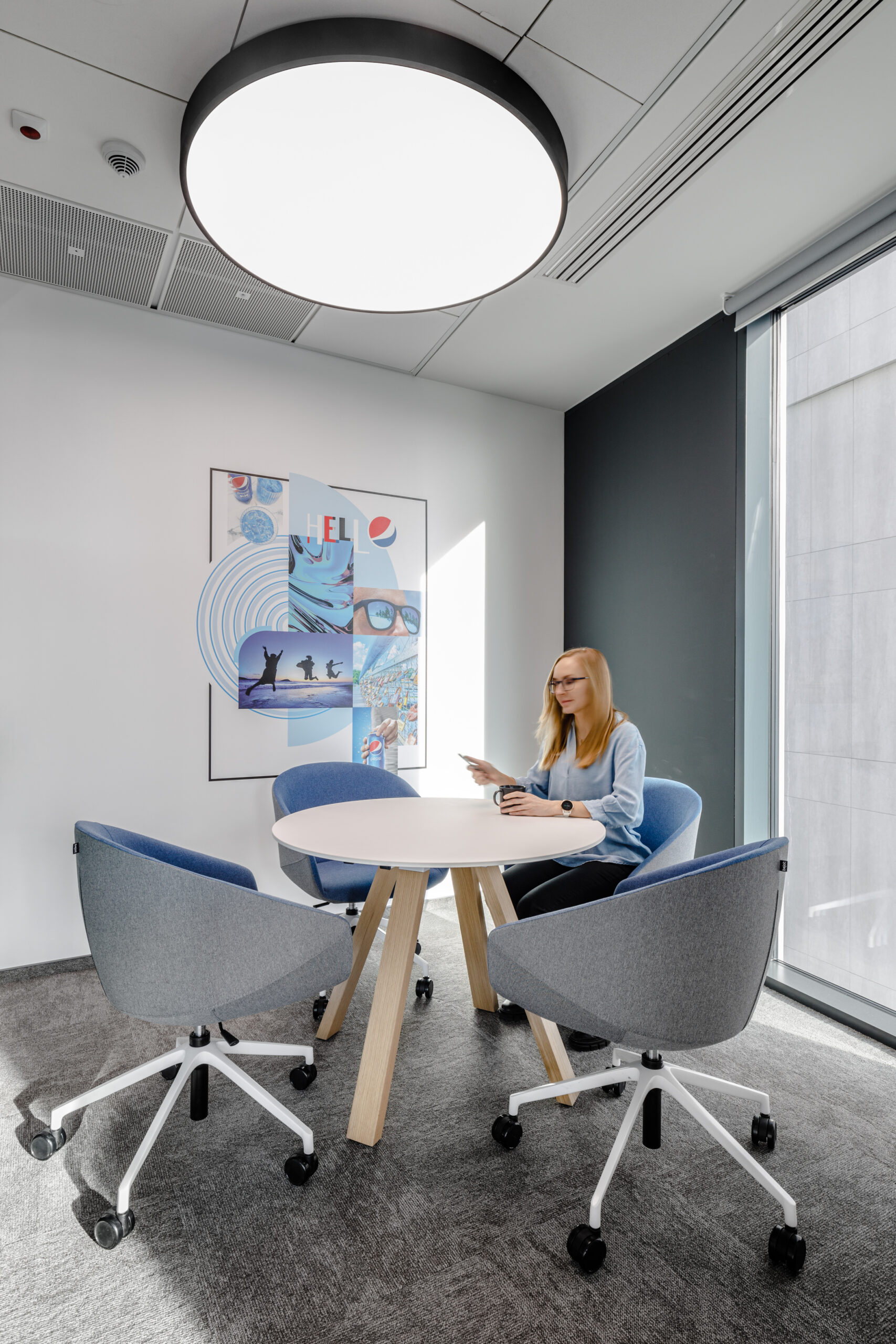
Colliers Define architects worked with PepsiCo to develop solutions that support the new work principles, adopted and promoted at the company under the umbrella slogan “work that works”. In practice, this means that PepsiCo’s new office relies on numerous co-working spaces, which at the same time ensure the convenience of working in comfort like a “home office.” For example, there are areas that allow people to perform work in their preferred way without sacrificing the integration with co-workers that is so important and desired upon returning to the office.
The heart of the office consists of representative social areas located on three floors, connected by an internal staircase, which also performs an integrative function by minimizing the distance between individual departments or teams. Creating such spaces was important in the office design of a company that is dynamically growing and building a new structure. Places that support the integration of new employees and help them feel part of the PepsiCo community were a necessity.
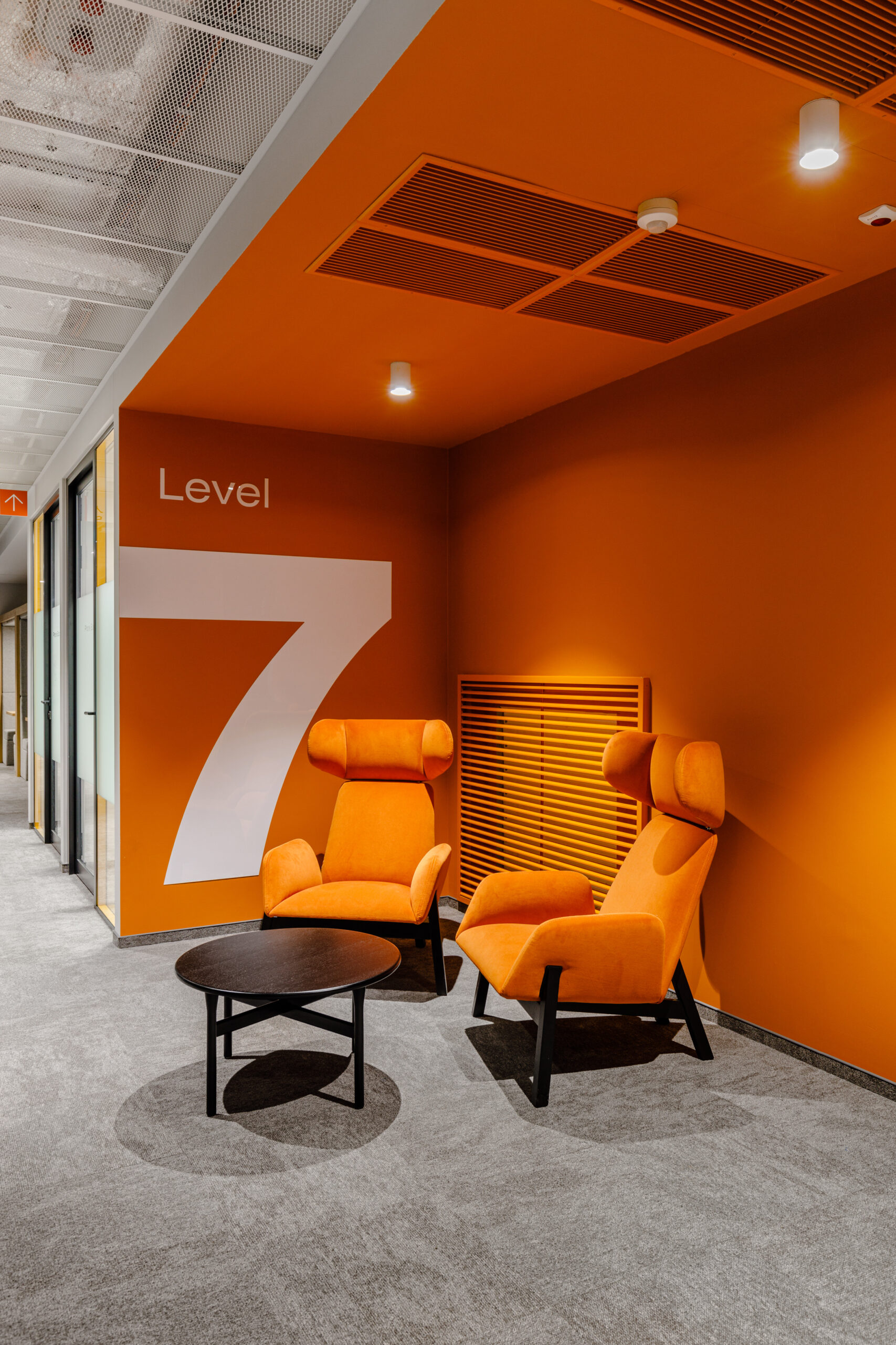
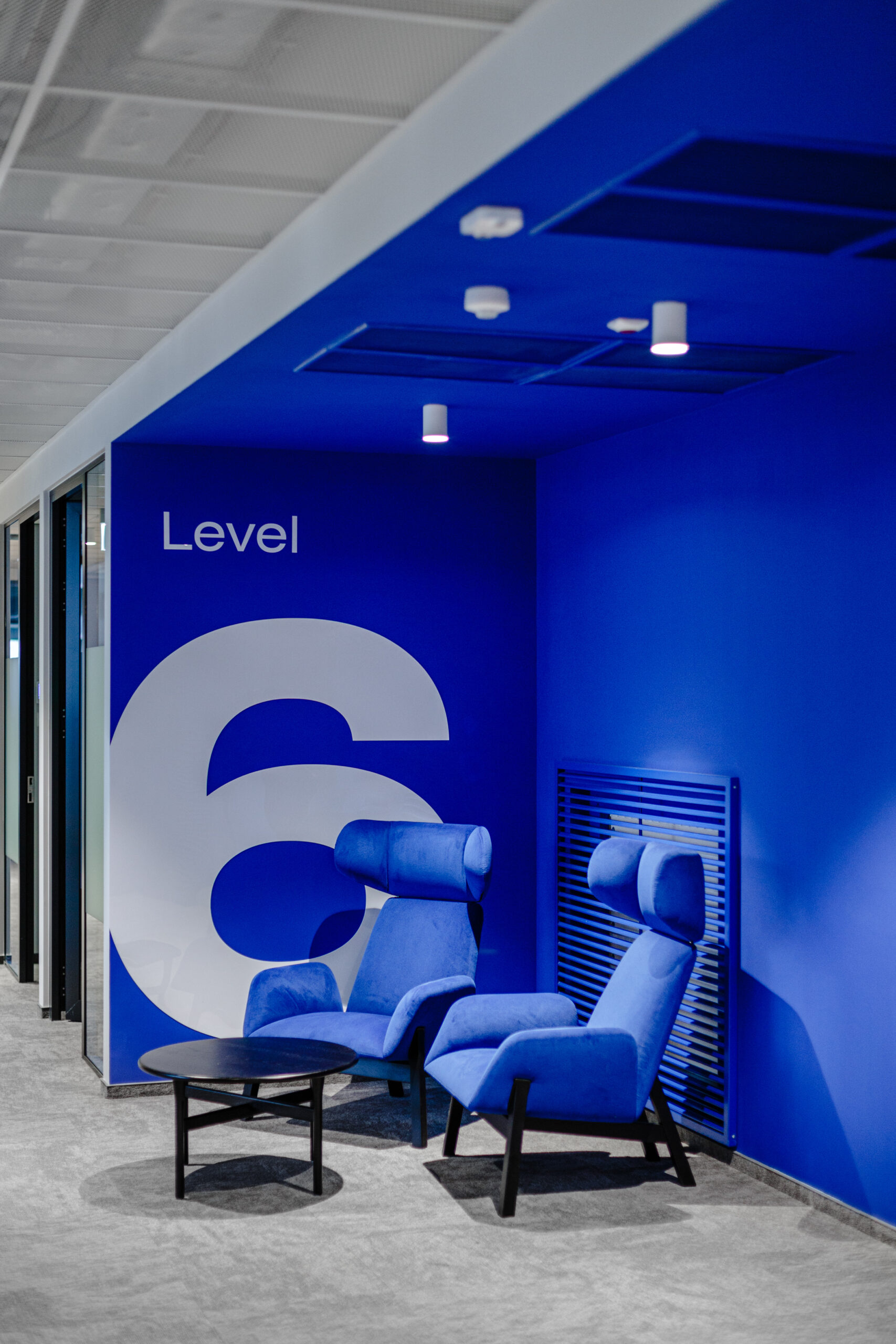
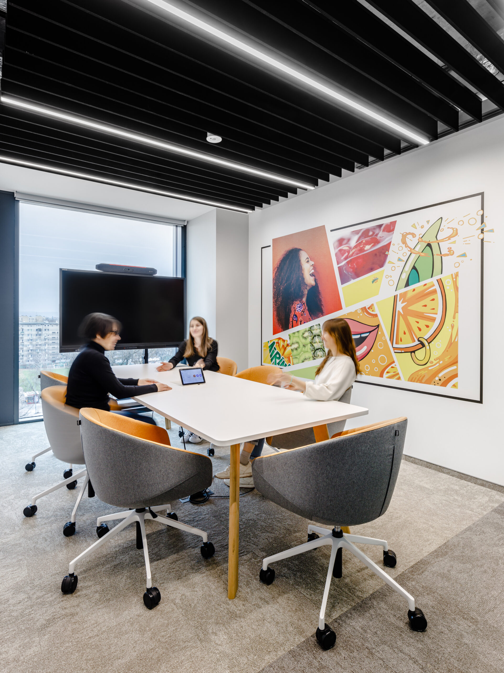
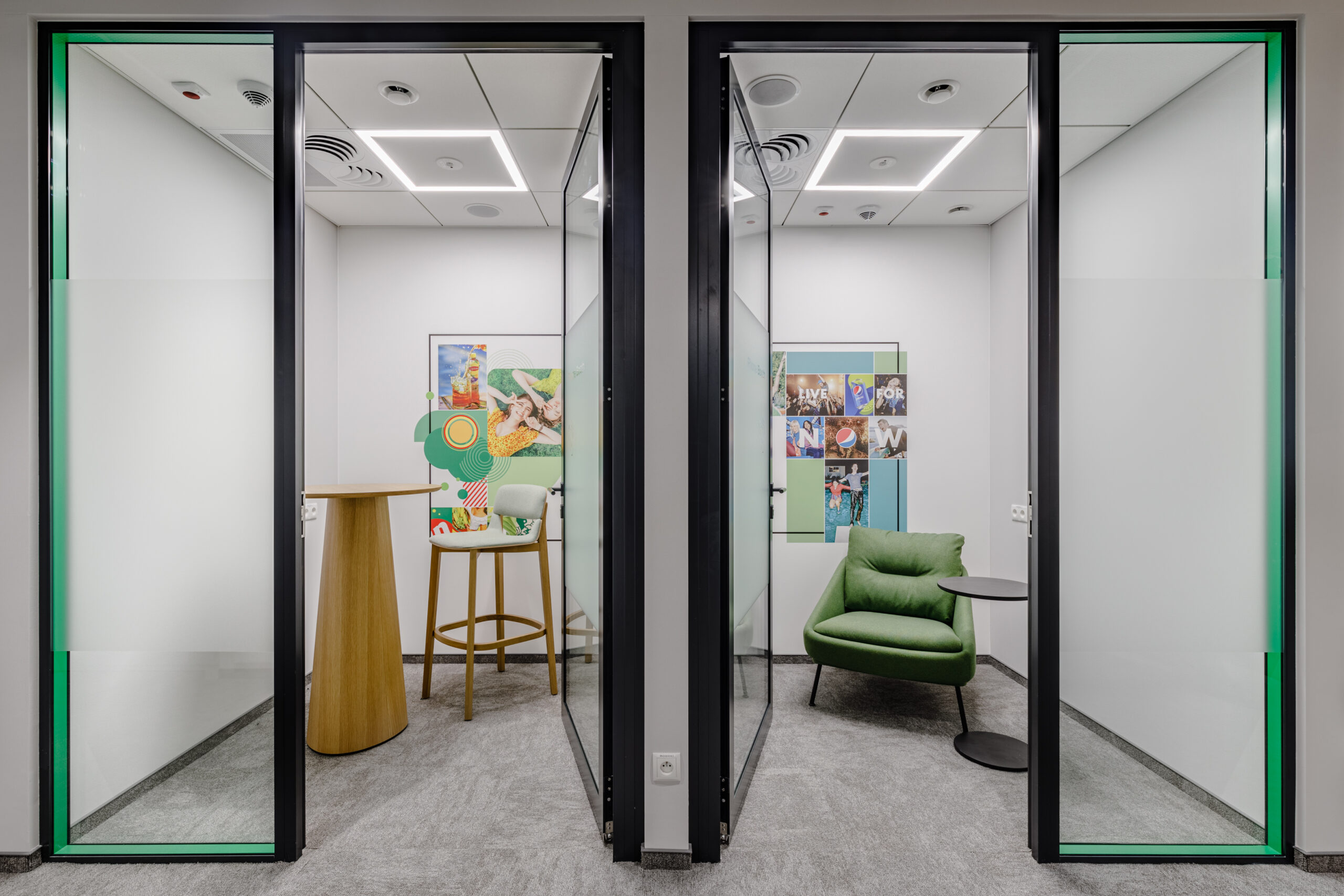
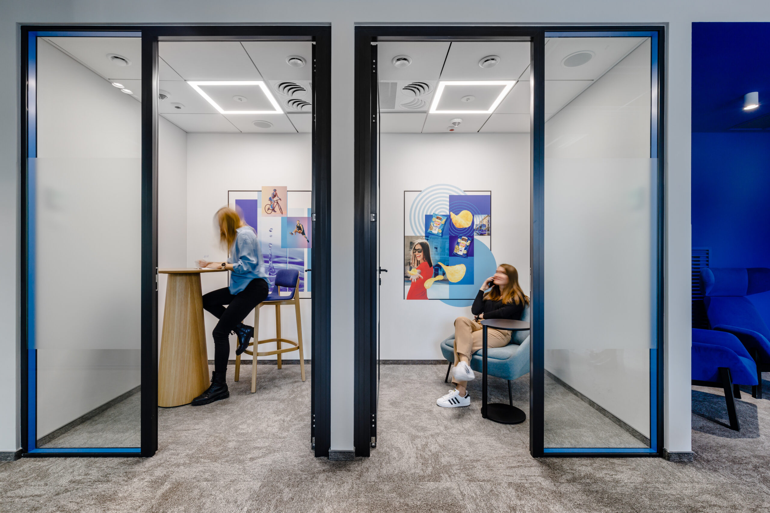
The color themes of each floor were inspired by PepsiCo’s flagship products – blue corresponds to Pepsi, green refers to 7up, while orange is a nod to Cheetos.
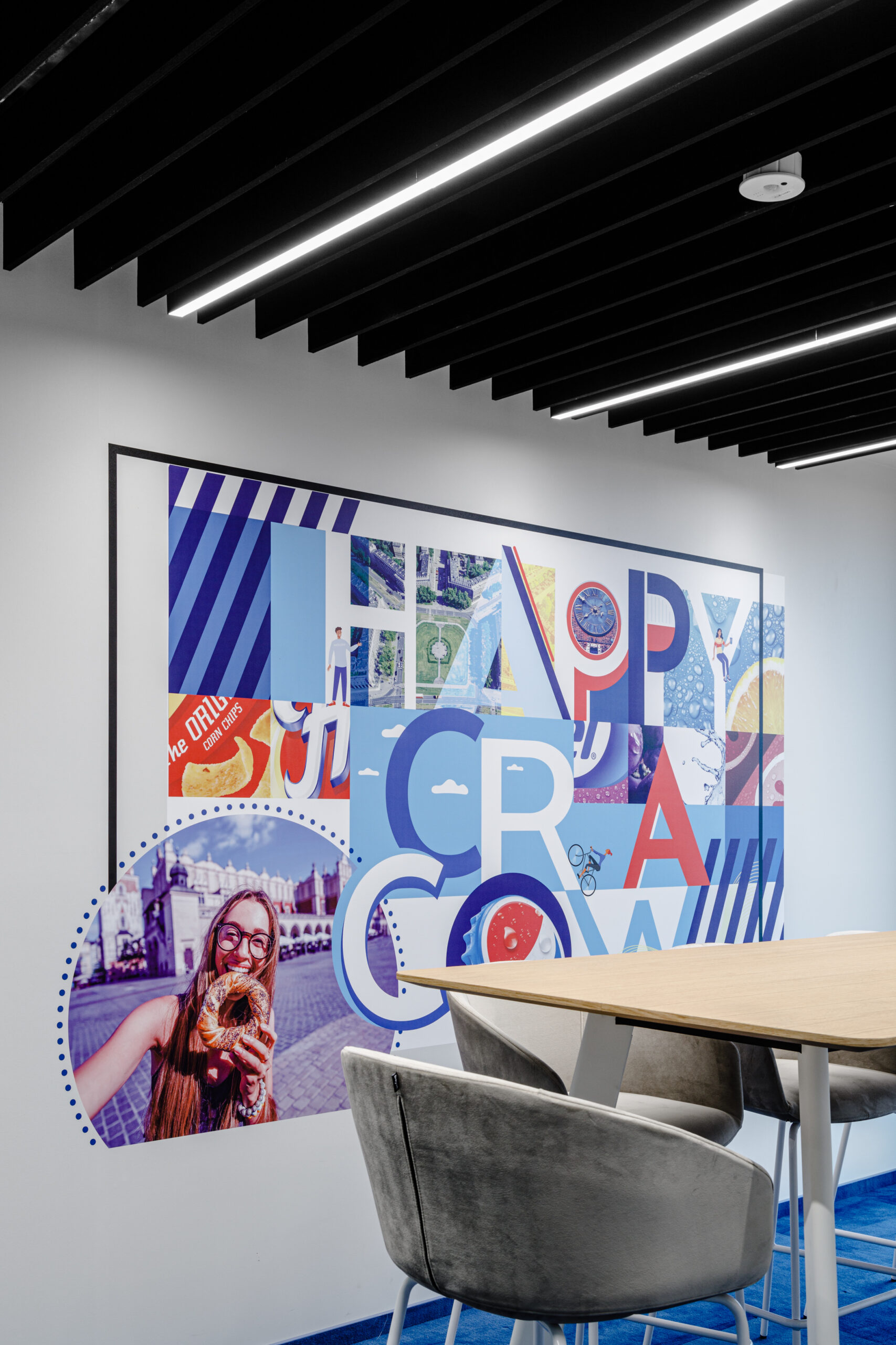
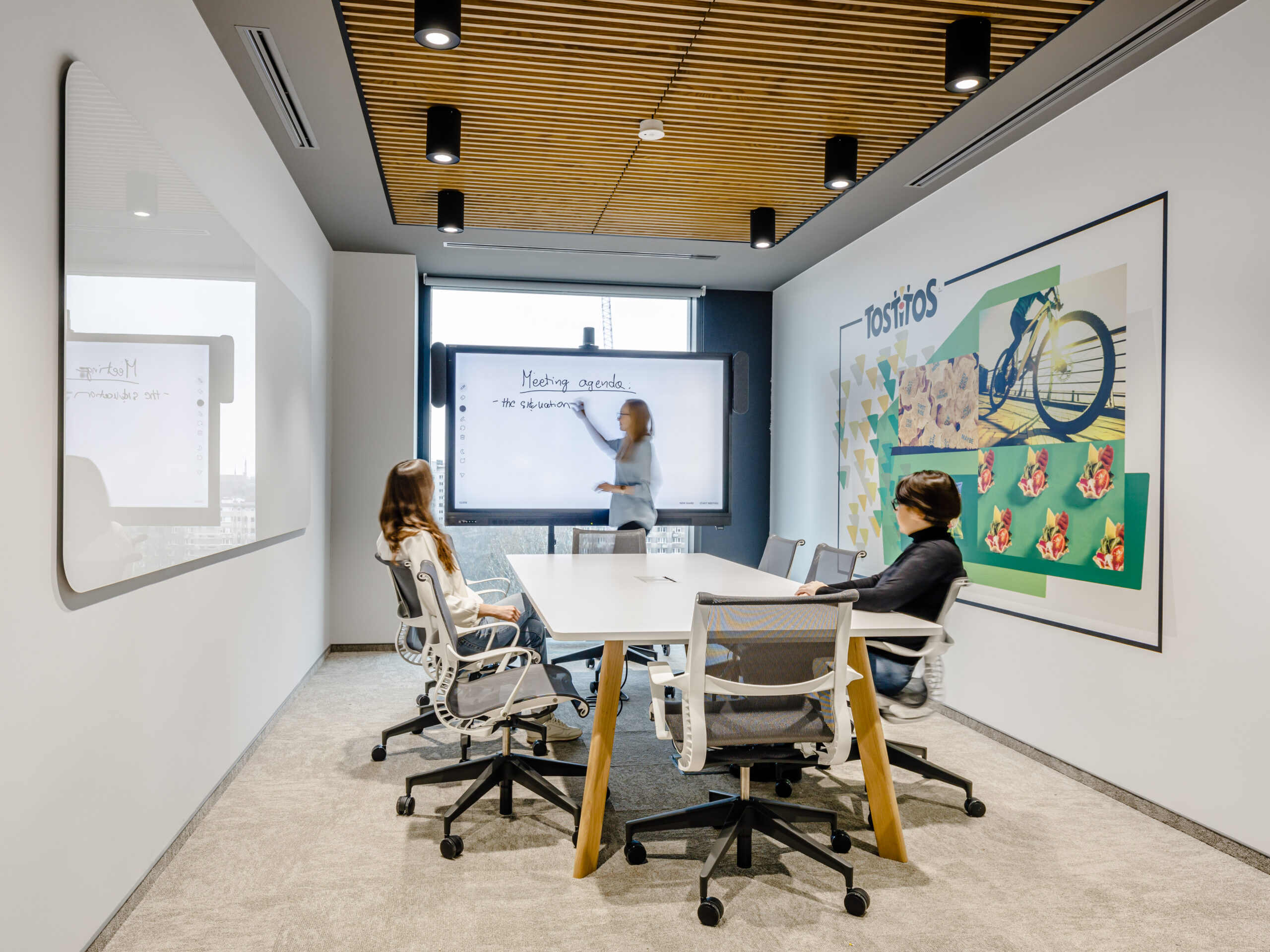
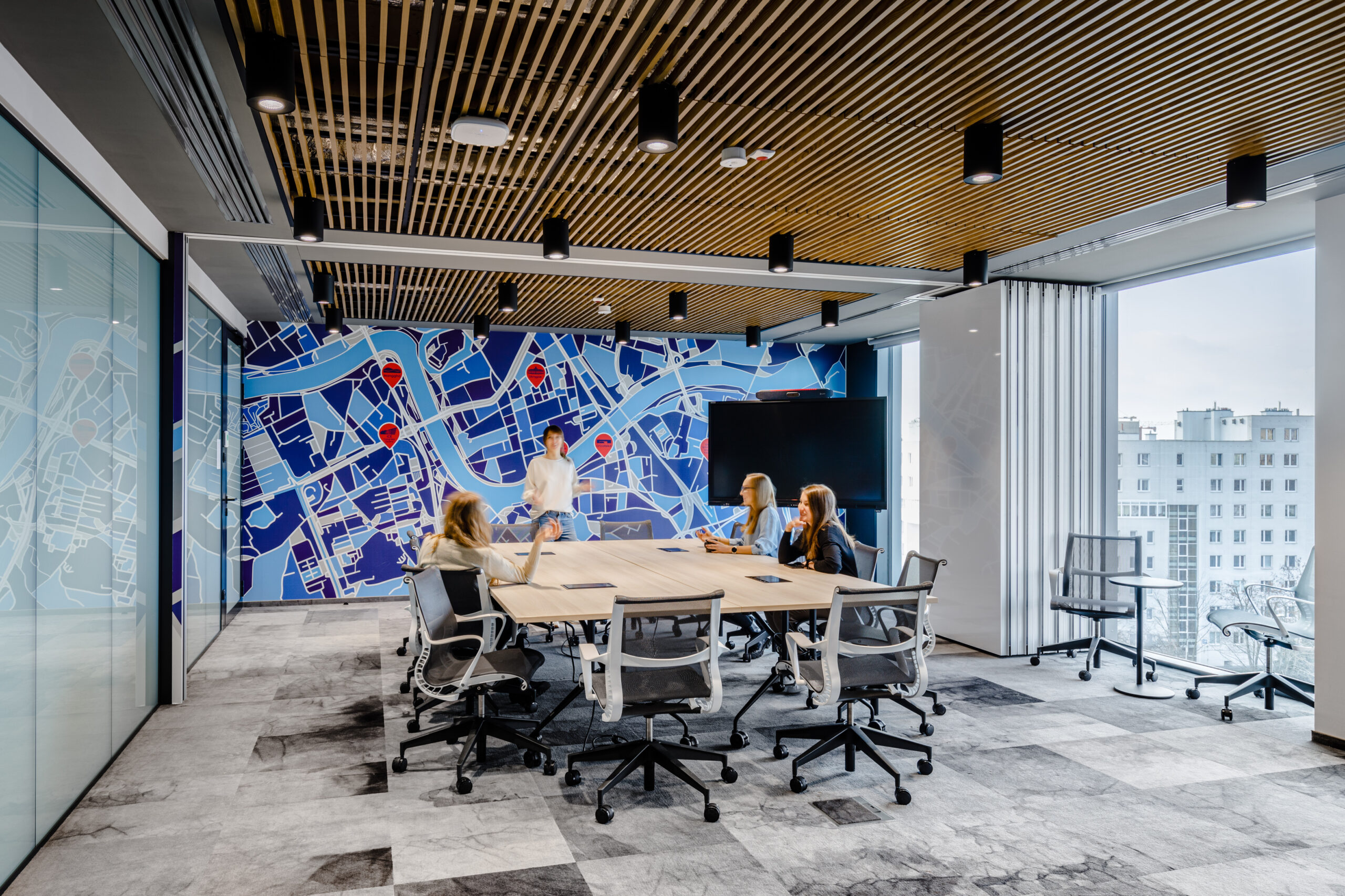
Distinctive colors are just one feature of the office, which is based on the diverse branding of PepsiCo’s various brands. We also used wallpapers with graphics, each combining brand-specific elements with art that alludes to the office’s location in Cracow. Elements characteristic of the city were included in numerous graphics in the open space and became the main theme of the largest conference rooms.
Socially responsible project
PepsiCo’s new space in Cracow is more than merely expressive and atmospheric interiors. It is also a nod from the designers and the company towards responsible solutions. Most of the furniture in the office are products of Polish brands, which has significantly reduced the carbon footprint, avoiding transportation from abroad, while supporting local manufacturers. They were arranged in such a way as to maximize the use of natural light.
Other eco-friendly solutions used in PepsiCo’s new office include:
- a motion sensor system for saving energy,
- touch-free toilet facilities that improve hygiene and safety,
- recycled finishing materials,
- the use of PepsiCo beverage pourers instead of using those packaged in disposable cans.
The idea of DEI (diversity, equity and inclusion) has been depicted through the variety of personas presented on graphics in the office space and in English-language spatial communications, among other things. With the diverse needs of employees in mind, PepsiCo also plans to introduce architectural solutions that facilitate the movement of people with disabilities, including office signage in Braille.
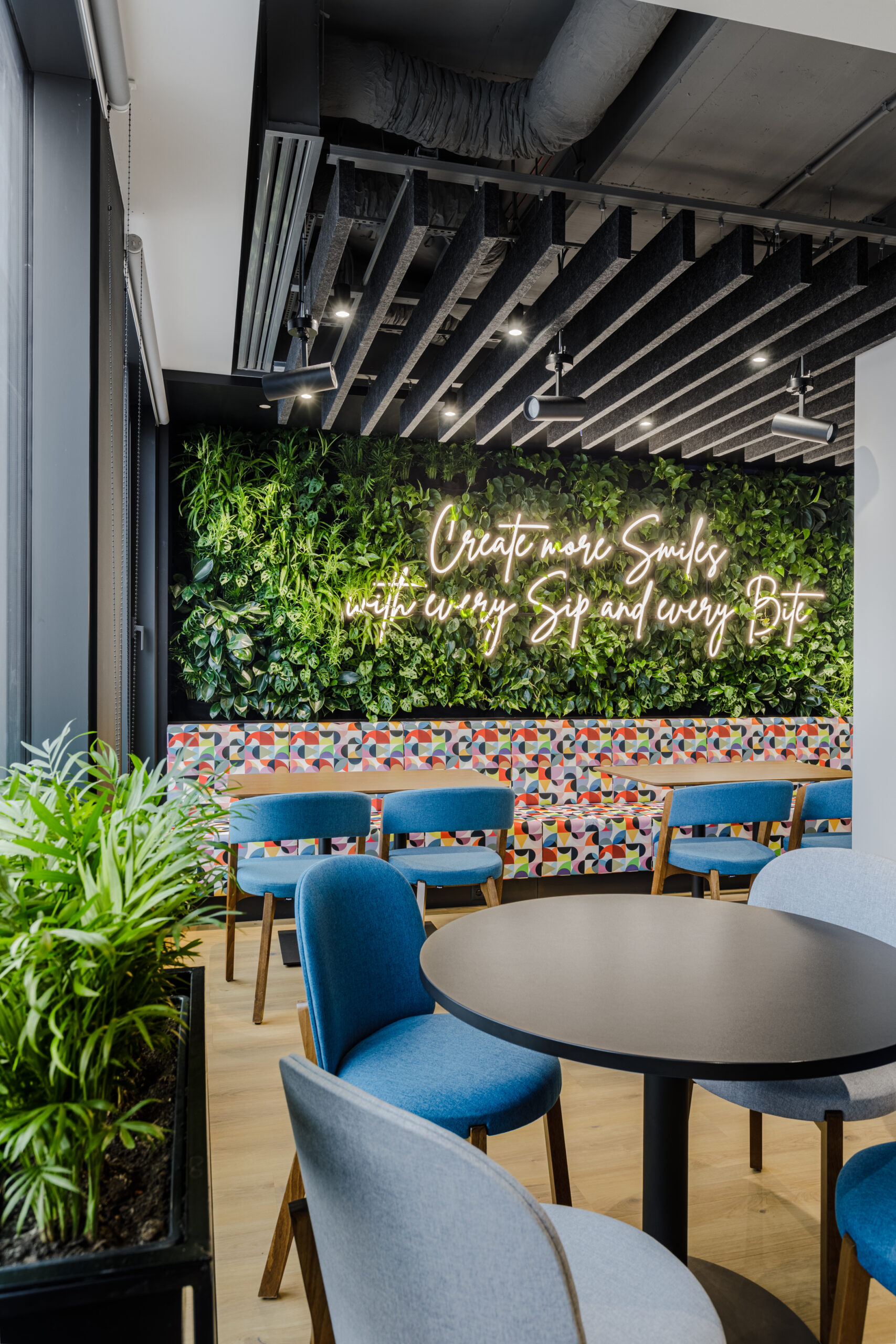
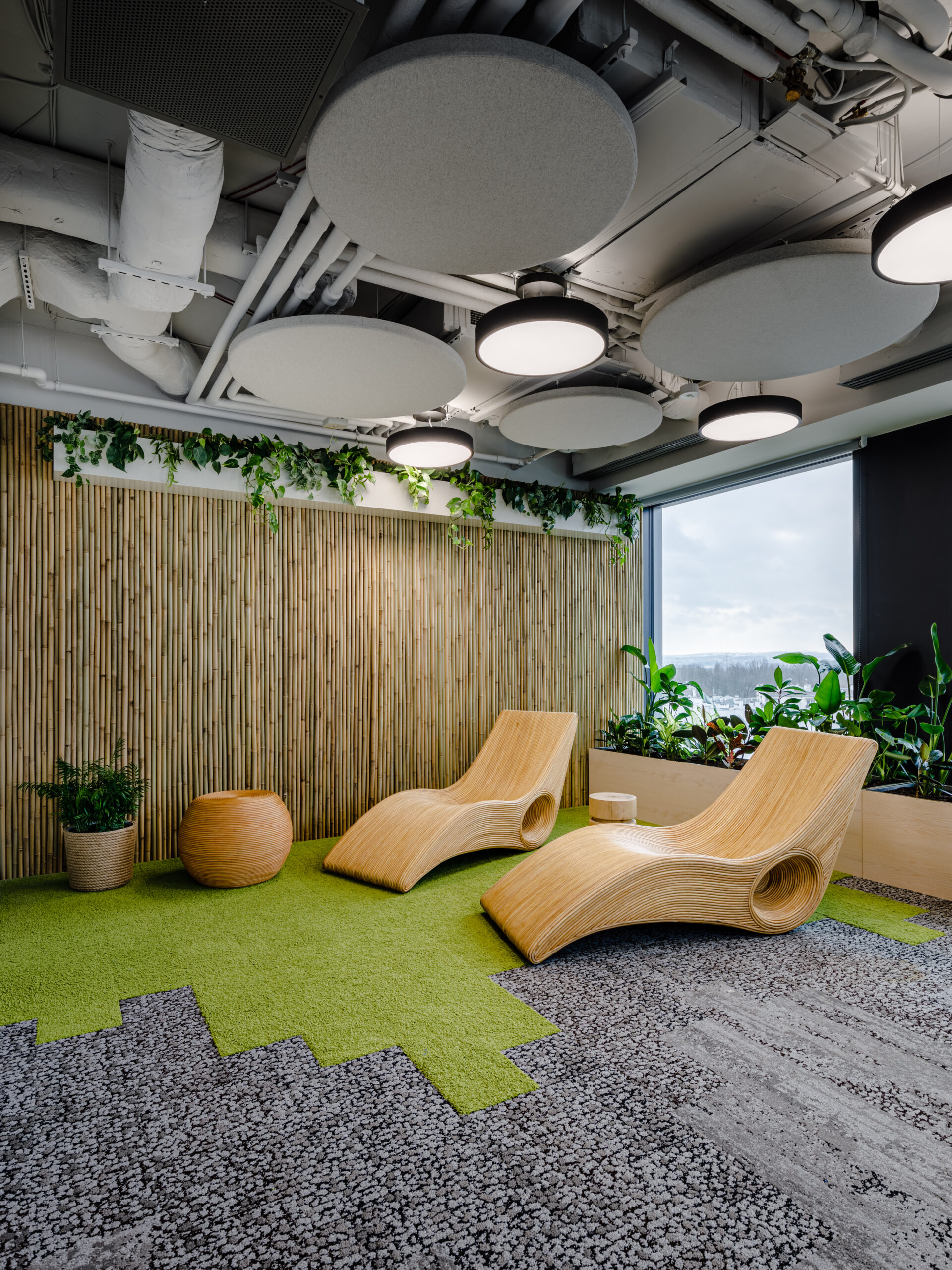
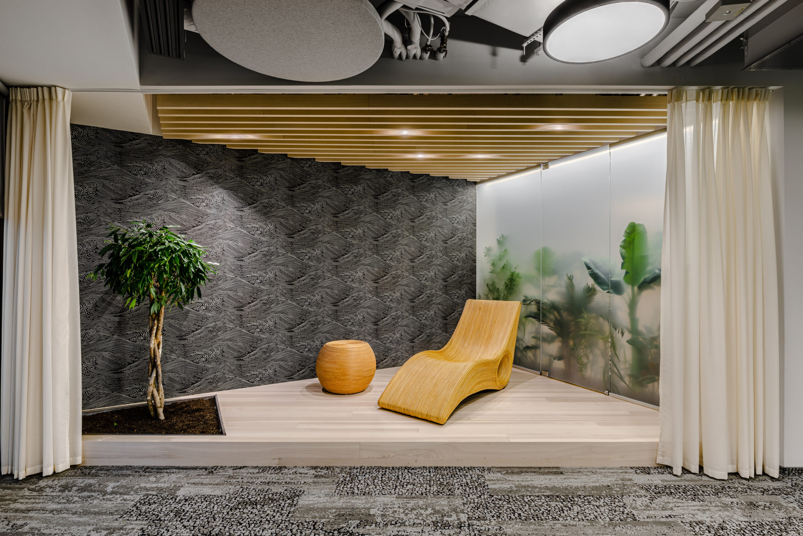
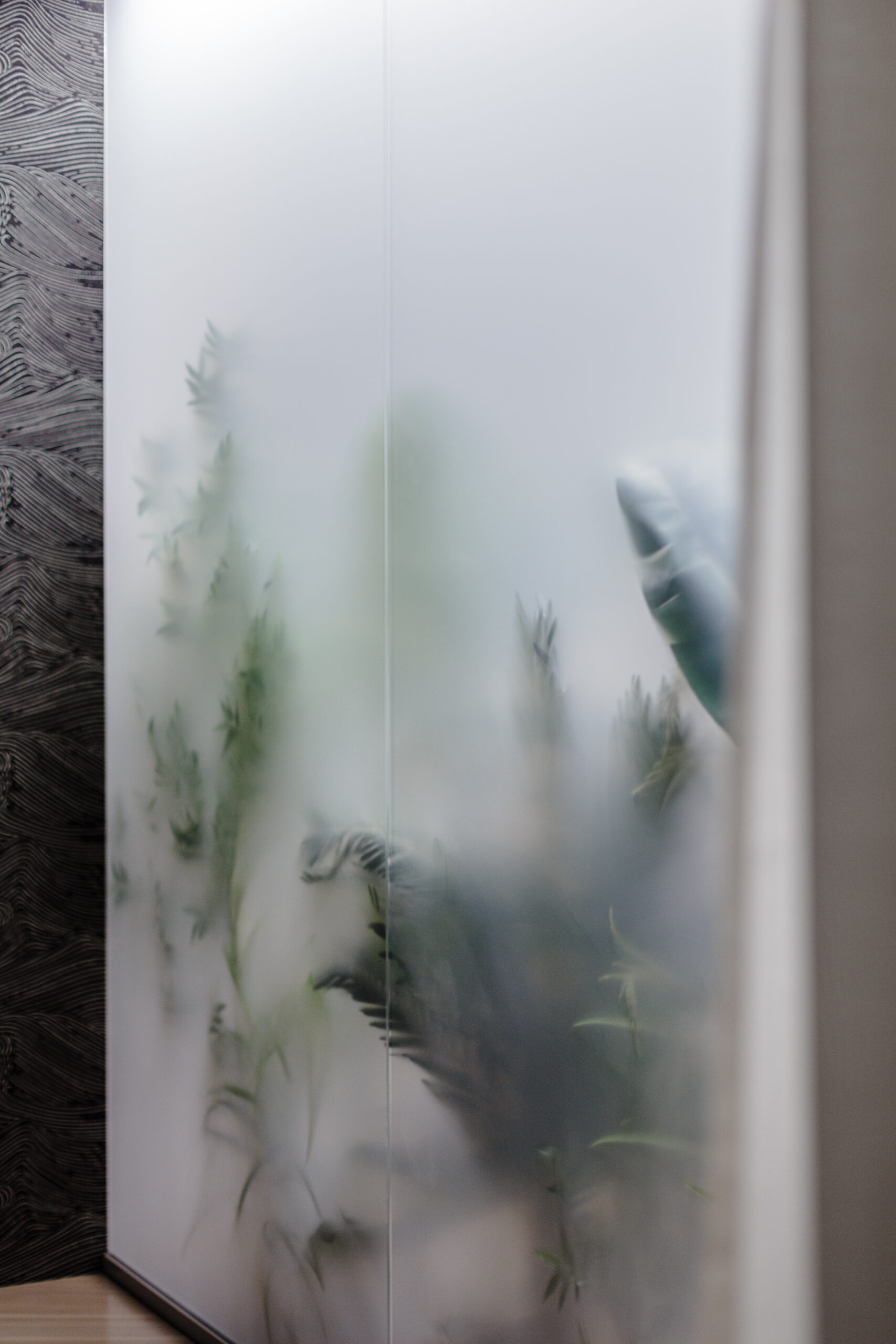
As a responsible employer, the company also cares about the well-being of its employees, by providing not only a variety of comfortable work spaces, but also arranging places for relaxation. We have delivered these using densely arranged plants in the office and a deliberately planned… lack of power plugs. There are intentionally no outlets or any branding elements in the dedicated relaxation area, so that the time spent here will be spent on activities other than work.
New reality
PepsiCo’s new headquarters is a functional and design-driven space for work and photos, that illustrates the company’s energetic character, innovatively combined with the symbolism of Cracow. It is an office tailored to a hybrid work model that attracts talent and encourages employees to spend time there.
